











A well-designed menu establishes an instant visual link between the patron and the dining experience, doing much more than just listing foods. As soon as a customer picks up the menu, they begin to create thoughts about the establishment's character, quality, and atmosphere in addition to the food. The menu is an effective branding strategy for every type of restaurant, whether it's a fast-casual, elegant bistro, or a small café. Visual attractiveness is, therefore, a crucial component of menu design. A visually appealing menu draws in customers, directs their gaze, and gently shapes their decisions. This article examines the essential components of menu design that improve the overall dining experience and increase the menu's visual impact.
Layout and Hierarchy
One of the most basic components of visual appeal in menu design is a carefully planned arrangement. Consumers usually scan and concentrate on particular areas of a menu rather than reading it word for word. Profitable ordering decisions can result from the thoughtful arrangement of meals, especially those with large profit margins. In this process, visual hierarchy is crucial. Different font weights, widths, and spacing are used by designers to highlight the most crucial elements. Readability is further improved by classifying related foods into parts (appetizers, main courses, and desserts). The menu appears more welcoming thanks to the use of columns, grids, and lots of white space, which helps avoid clutter. In the end, a neat and well-organized structure serves as a visual road map, allowing visitors to navigate their alternatives with ease and promoting deliberate choices.
Typography: Harmonizing Readability and Beauty
The customer's capacity to interact with the menu is greatly impacted by typography, which is more than just a cosmetic decision. The restaurant's identity can be strengthened, the brand's voice supported, and emotion evoked with the correct font mix. For instance, a sleek sans-serif font looks great in a modern, minimalist setting, whereas a rustic serif font may work well in a farmhouse-style restaurant. However, legibility and typographic inventiveness must always be balanced. Overly styled or elaborate fonts can make it difficult to read, particularly on textured backgrounds or in low light. In order to create visual contrast and highlight important elements, effective menu designs usually utilize one or two font families to maintain continuity while adjusting the font weight and size. Additionally, color is a crucial supporting element that provides contrast while being usable by all visitors, including those who are blind or visually impaired.
Using Texture and Imagery to Create a Sensual Experience
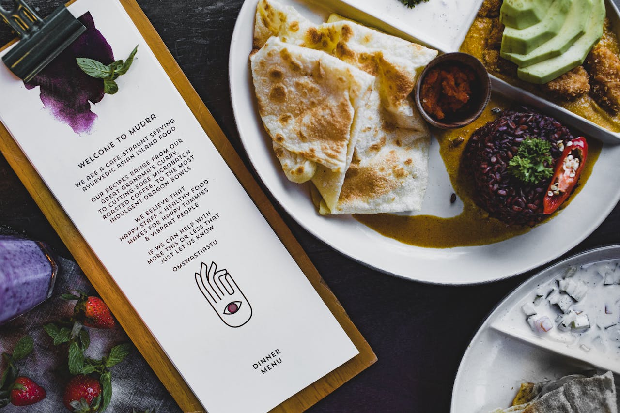
Not many menus have pictures, but when they do, they need to be carefully chosen. Certain foods can be made more appealing by using high-quality food photography, but excessive use or poor image quality might backfire and make the menu appear cluttered or cheap. The delicate application of visual texture, which can enhance the sensory experience without overpowering the text, is equally significant. Here's when design tools like Photoshop Texture Brushes are useful. For example, brushes let designers add hand-drawn features or soft textures that give a layout depth and coziness. Textured materials can represent the tactile essence of dining, whether it's a woodgrain background for a rustic atmosphere or watercolor accents for a homemade impression. They heighten anticipation and establish the mood for the meal by encouraging visitors to interact more emotionally with the menu.
Color Psychology
Menu design color selections are by no means random. Restaurants may make great use of the fact that different hues elicit distinct psychological and emotional reactions. Many fast-food companies use warm hues like red, orange, and yellow because they increase energy and hunger. Cooler colors like blue and green can communicate calmness and freshness, which is why vegan or health-conscious businesses frequently utilize them. White, beige, and charcoal are examples of neutrals that can add refinement while highlighting other design components. Maintaining readability requires making sure that the background and text contrast. Additionally, accent colors can be used to emphasize seasonal specials or attract attention to particular meals. When utilized carefully, color inspires the intended mood, establishes a unified visual identity, and subtly guides the diner toward particular decisions.
Branding Consistency
When a restaurant's visual appeal complements its whole branding, it works best. Everything about the menu should feel like an extension of the dining experience, from the descriptions to the photo selection. While a sophisticated wine bar would use simple design and sophisticated typography, a fun, family-friendly diner may use colorful images and informal fonts. Menus printed on thick cardstock or in leather-bound folders exude permanence and elegance, whereas laminated menus feel informal and practical. Materials and finishes also affect branding. The brand's voice should even be reflected in the wording of item descriptions. Maintaining consistency in branding increases recognition, promotes trust, and makes customers feel more a part of the business. From the first look at the menu to the last mouthful, the aim is to create a cohesive and unforgettable experience.
Designing a menu involves more than just aesthetics; it also involves persuasion, communication, and experience. Layout, font, photography, color, and branding consistency can all be carefully combined by designers to create menus that are both aesthetically pleasing and strategically sound. A well-designed menu conveys a lot about the restaurant's regard for its patrons and attention to detail. It provides diners with intelligent guidance, strengthens the brand, and makes eating out more enjoyable. A compelling menu can make the difference between a one-time consumer and a devoted following in the cutthroat food and hospitality industry. Therefore, spending money on menu design is not only a creative exercise but also a wise business move that will increase customer happiness, orders, and impressions.