







When a customer opens your menu, their eyes aren’t moving randomly. They’re following a path across the pages, pausing at certain areas but moving on from others in less time than it takes to crack an egg.
The way their eyes move and what catches their attention depends on your menu’s layout and the way you’ve used text and imagery to take them on a journey through starters, mains, desserts, drinks, and any other items you serve. There’s a science to this, and with these tips, you can maximize your menu’s potential and influence your customers’ choices, guiding them toward high-margin items, signature dishes, and a more satisfying overall dining experience.
The Golden Triangle Impacts Ordering Choices
The Golden Triangle design principle should serve as the foundation for your menu layout. Research tells us that eye patterns form within the first 10 seconds, and tracking studies show that people look toward the following sections of menus in this order, creating this triangle:
Put dishes you want seen quickly in those spots, like a high-margin main course, a house special, or a popular item, as it will be instantly noticeable.
Visual Hierarchy Guides Customers
Menus work better when they quietly point customers toward specific dishes rather than treating every item the same.
A small star next to a dish can signal it’s a top seller, a leaf symbol can show it suits vegan or vegetarian diets, or you can highlight a chef’s pick to draw attention to a house special or a dessert you’re promoting. These cues help people understand what they’re looking at without needing to read every word in the description.
Boxes help too. Placing a dish within a light border or a shaded background makes it stand out from the rest. Extra space around an item does the same job and gives it more presence on the page. Just make sure you don’t overdo it. If every dish is marked, nothing stands out.
Descriptive Wording Drives Decisions
The wording on your menu gives customers a clear idea of what they’re ordering and helps them to decide if it’s what they want.
Strong descriptions in your menu design focus on what matters most. Tell customers how the dish is cooked, why it stands out, and what to expect on the plate. Slow-cooked beef with a rich and creamy sauce sounds much more appetizing than just beef stew. Freshly grilled chicken or crispy-skin salmon also tells the customer more about the dish before they order poultry or fish.
At the same time, clarity is key. If descriptions are too long or complicated, customers slow down or lose track of what they’re reading. Short, direct lines work better, keeping the menu easy to read while still providing enough detail to help make a choice. Your typography and font is critical here, too. Keep it clean, easy to read, and aligned with your restaurant’s style.
Visual Design Draws Attention to Key Dishes
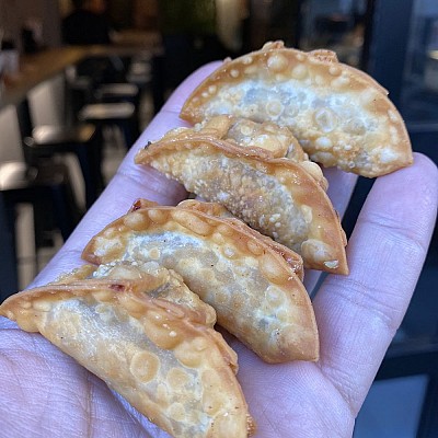
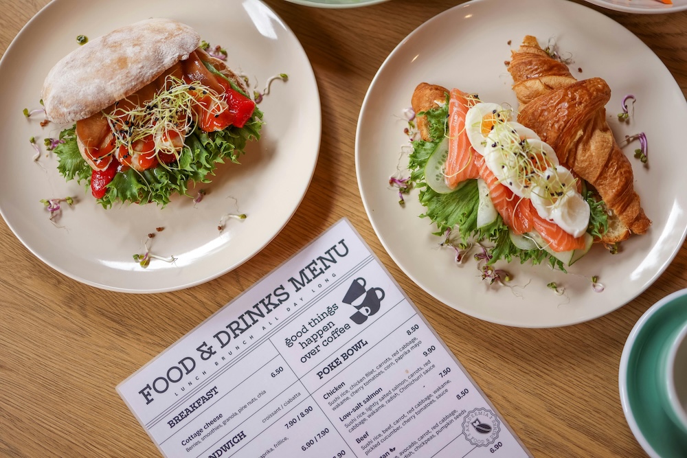
Pictures are worth a thousand words, so consider placing them at customers’ natural eye level in your menu layout to highlight certain dishes. Using images is an excellent way to draw attention to specialties, more unusual offerings, and dishes that set your restaurant apart.
Seeing what food actually looks like changes how it’s judged. It provides immediate context, making it easier to understand what is being ordered and reducing hesitation, speeding up selection.
Quality is vital here. Clear, well-lit photography presents dishes in a mouthwatering way, while poor images can have the opposite effect, putting customers off.
Color Impacts What Customers Choose
Different shades influence mood, appetite, and perception, often without customers realizing it. Research shows that color can affect food cravings and impact how much people feel like eating, with some tones increasing desire while others reduce it.
Adapted Design for Online Menu Layouts
Digital menus follow many of the same principles as printed menus, but the way your customers interact with them differs. Instead of scanning a full page, people scroll quickly, making the first few items they see far more influential. This means your most profitable or popular dishes should appear early, whether that’s at the top of a category, in a featured section, or highlighted as a recommendation.
Online or on mobile, structure becomes even more important. Clear categories, simple navigation, and minimal clicks help customers move through the menu with ease, and if they have to search too hard, they’re more likely to default to familiar options or abandon the process altogether.
Additionally, images carry more weight in a digital setting. On smaller screens, a strong, high-quality photo can stop the scroll and prompt a decision almost instantly. When paired with concise, easy-to-read descriptions, you create a smooth path from browsing to ordering.
Creating an effective online menu is also more accessible than ever. Many restaurants now use AI tools or online design platforms to quickly build and refine their menus, experimenting with layouts, descriptions, and imagery to see what performs best. They make it easier to update your menu, too, so even minor changes can be implemented speedily.
Serving Up Smarter Menu Design
Whether in-house or online, a good menu should be like a dish that’s been perfectly plated. Finding the right balance between all the different elements is important because if everything is loud, nothing stands out. And if nothing stands out, people hesitate. You need to find the point where it just clicks.
Get it right, and people won’t overthink their meal. They’ll spot what you want them to see, order it, and enjoy.