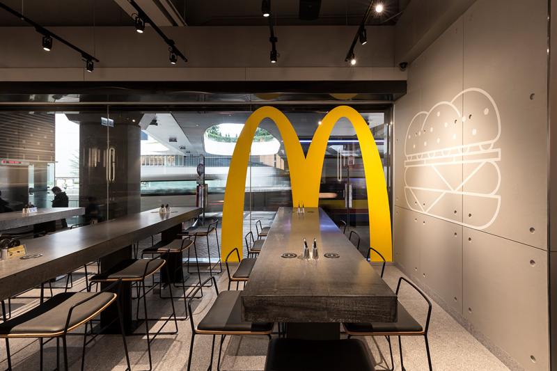
Following the new trend where many fast food joints are upgrading their interiors, McDonald’s in Hong Kong has completed been changed and given a new sleek and sophisticated interior design they’re calling “McDonald’s Next.”

Working together with design firm Landini Associates, they’ve completely transformed everything about what we normally think a McDonald’s looks like.
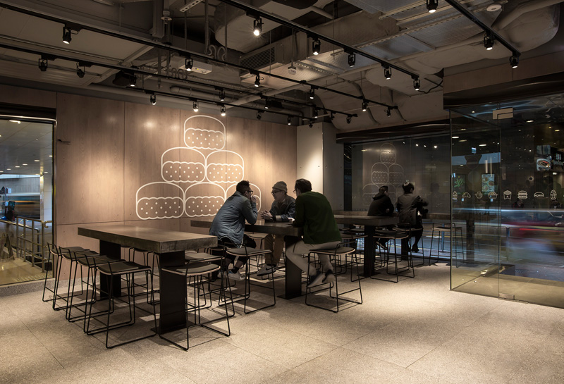
Gone are the red and yellow hard plastic seats and Ronald McDonald, leaving the only recognizable icon in the new space being the golden arches.

Using concrete, glass, stainless steel and oak, the fast food restaurant adopts a stylish and sleek façade with minimal artwork. The illustrations on the walls pay homage to the brand’s iconic products, including the simple cheeseburger. Patrons can make their order with customizable options through touch-screen kiosks. Food is either picked up at the counter or brought to your table if the order is placed after 6pm.


