April 17, 2019

Heineken Goes Into the Details with New Packaging

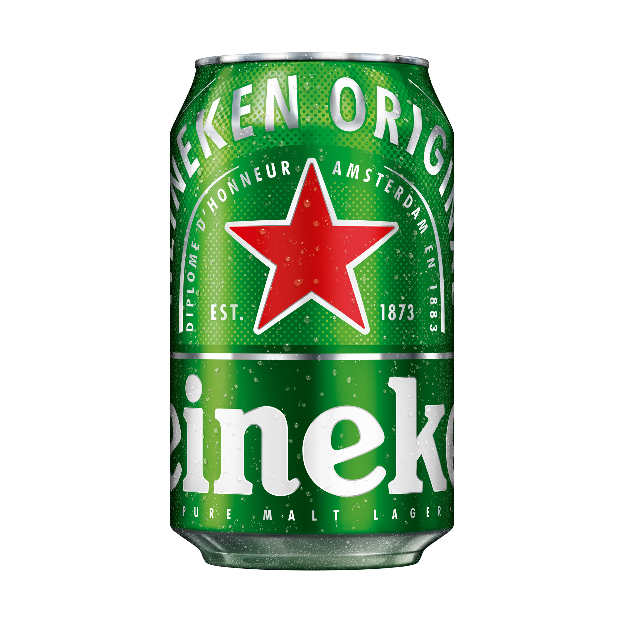
Heineken just revealed a new packaging that amplifies the brands signature. Studio VBAT collaborated with the beer brand to give self-confidence on its cans.

heineken_2019_can_before_after

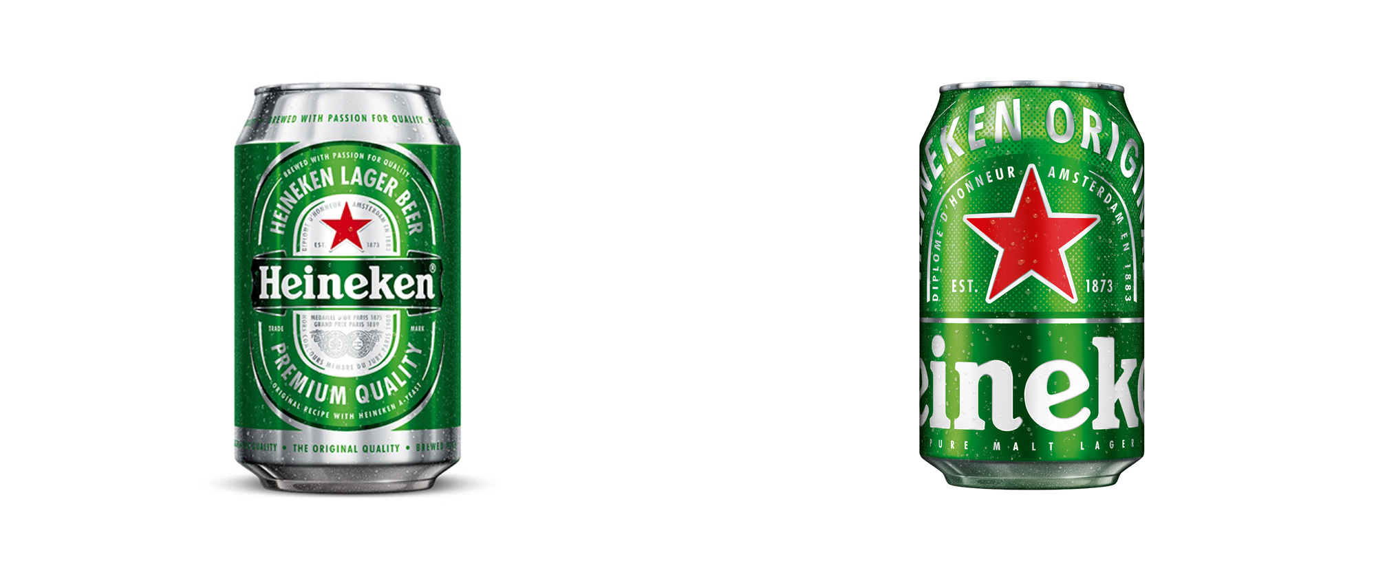
VBAT amplifying Heineken’s signature emblems - its iconic green and red star symbol - and minimizing miscellaneous details.

Heineken’s classic red star has been elevated as a “bright, bold and contemporary icon,” with its logo encircling the can for a more striking look. While the playful wordmark will not be visible in its entirety, the brand’s longstanding heritage means it remains recognizable.

The new cans have be introduced in Mexico, Poland, France and Brazil, and there are plans to debut them globally in the near future.

Categories: News

LOCATIONS

CATEGORIES

FILTER POSTS


RECENT COMMENTS

"C heck My Assignment " is typically a service or tool designed to help students review and assess… - on Re: How to Write the Perfect Business Plan for Your Food Truck

This article offers an insightful look into the role of luck and strategy in 51 Club online color… - on Re: Online Color Prediction Games: Luck vs. Strategy – Which Matters More?

Flowers Mallorca is a leading floral and gourmet gift delivery service based in Palma de Mallorca,… - on Re: Beirut.com: Upgrade Your Gifts: Alternative Gifts Ideas!

This article is such a fantastic guide for food-loving travelers! One of the best ways to… - on Re: 9 Ways to Discover Authentic Cuisine on Your Next Travel Adventure

https://uploads.disquscdn.c... - on Re: The Importance of Commercial Kitchen Layouts in Reducing Waste and Maximizing Efficiency


PREVIOUS ARTICLE

Google Local Guides Summit 2017: Photos and InstaStories

NEXT ARTICLE

Special Edition Coca-Cola Bottles for Star Wars: Galaxy’s Edge